THE GOAL
Create a more intuitive and visually
appealing mobile investing application
appealing mobile investing application
Role: Project Lead
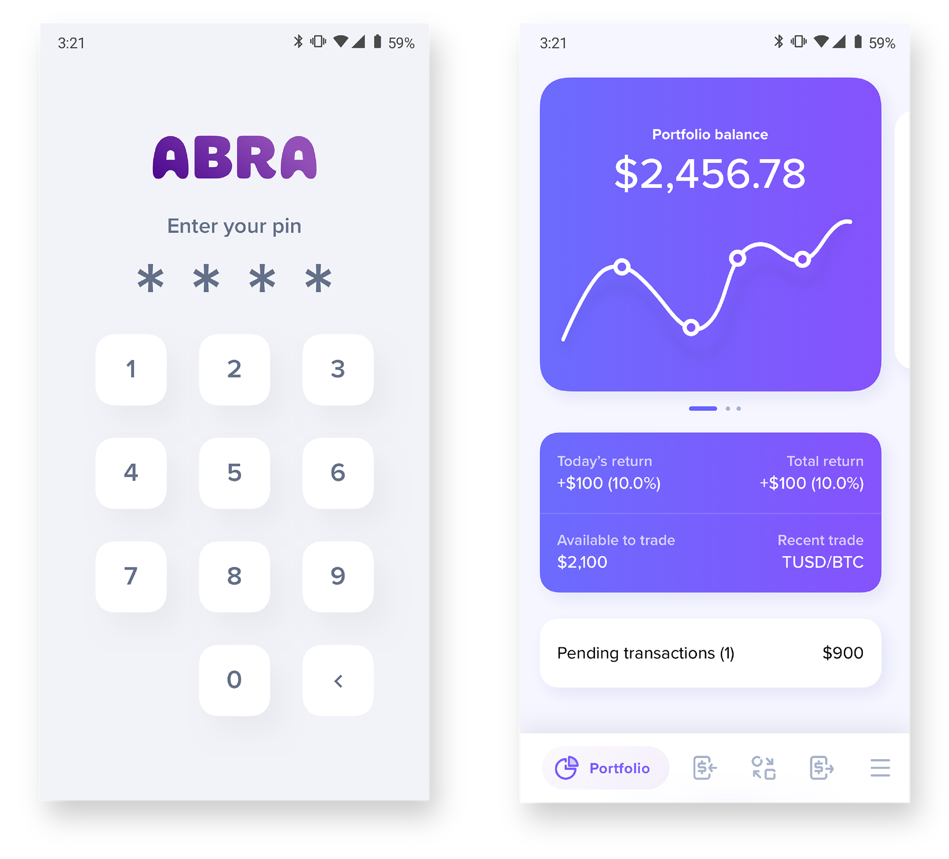
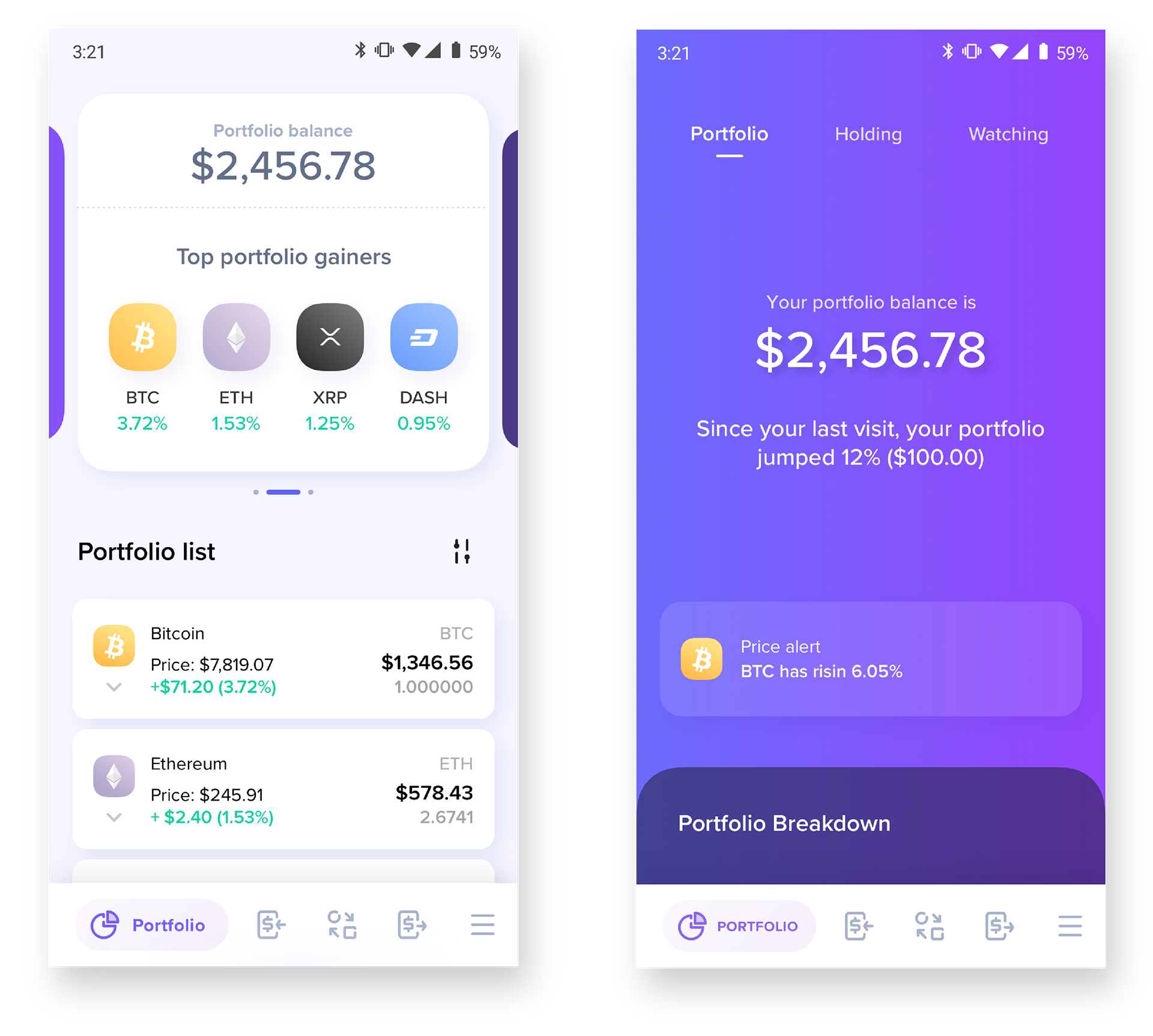
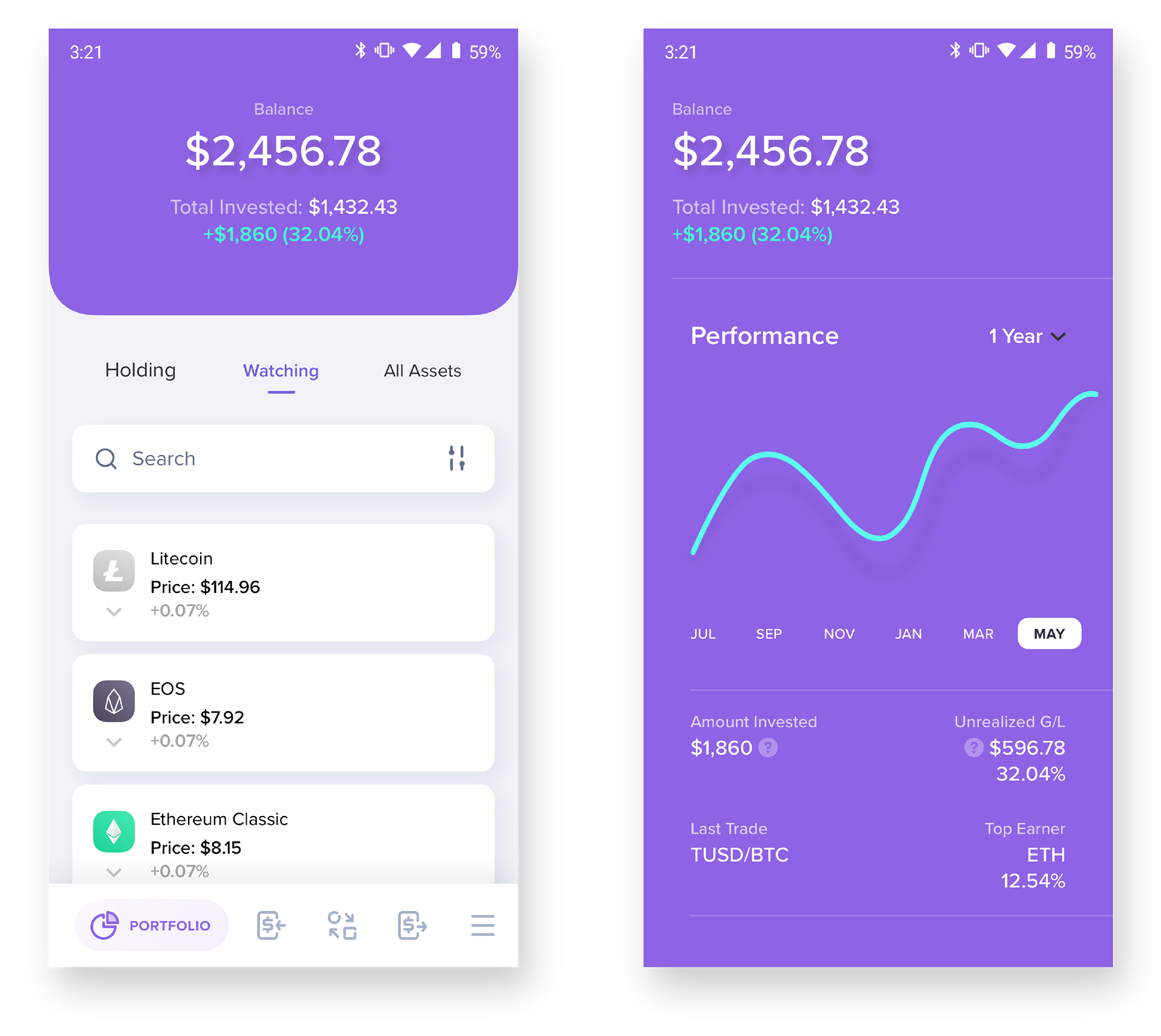
THE APP AT A GLANCE
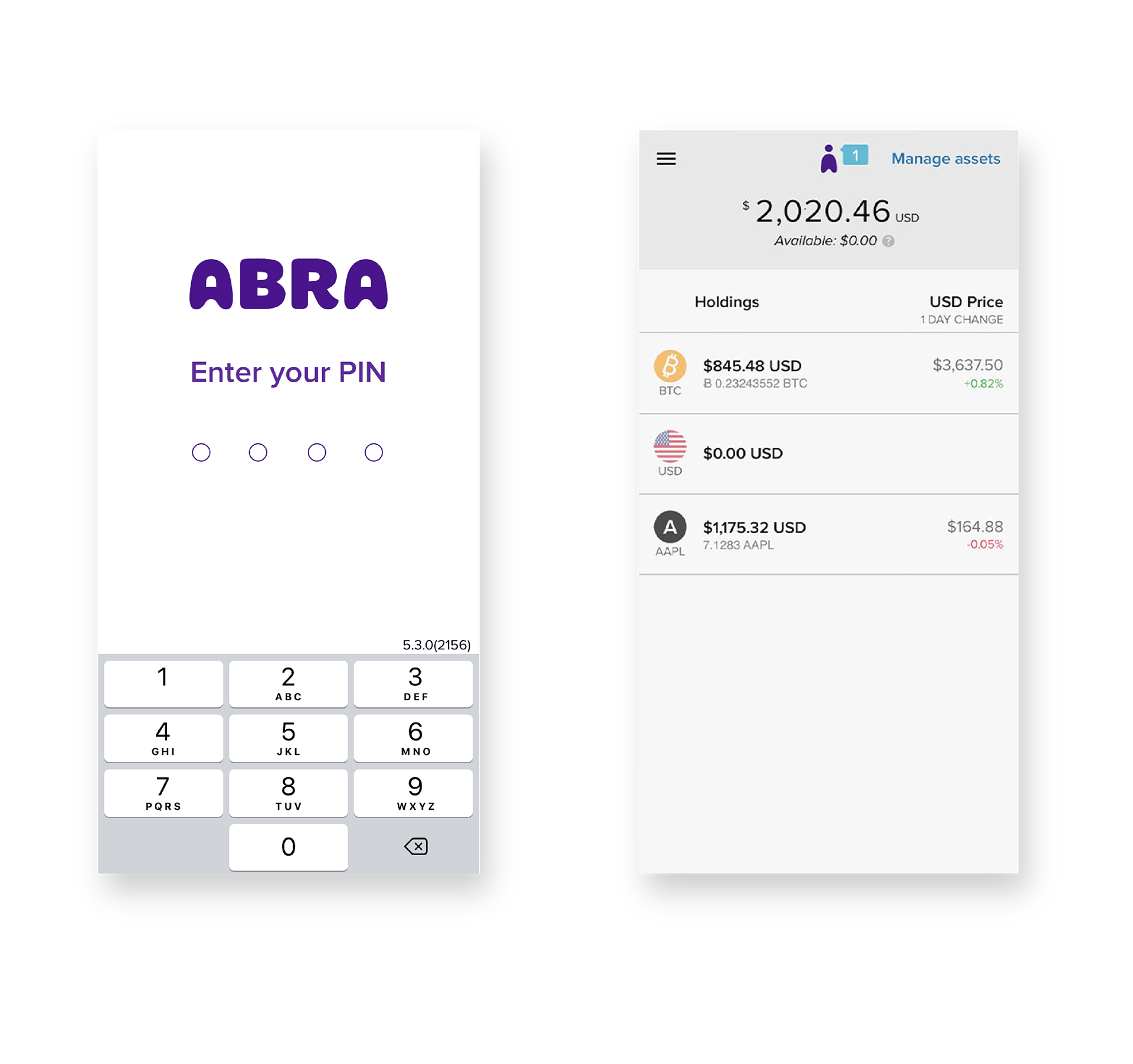
USER FEEDBACK
“Portfolio is really confusing, hard to tell which assets are which and how much i’m holding of each”
“Asset only shows transactions in the detail screen, nothing else”
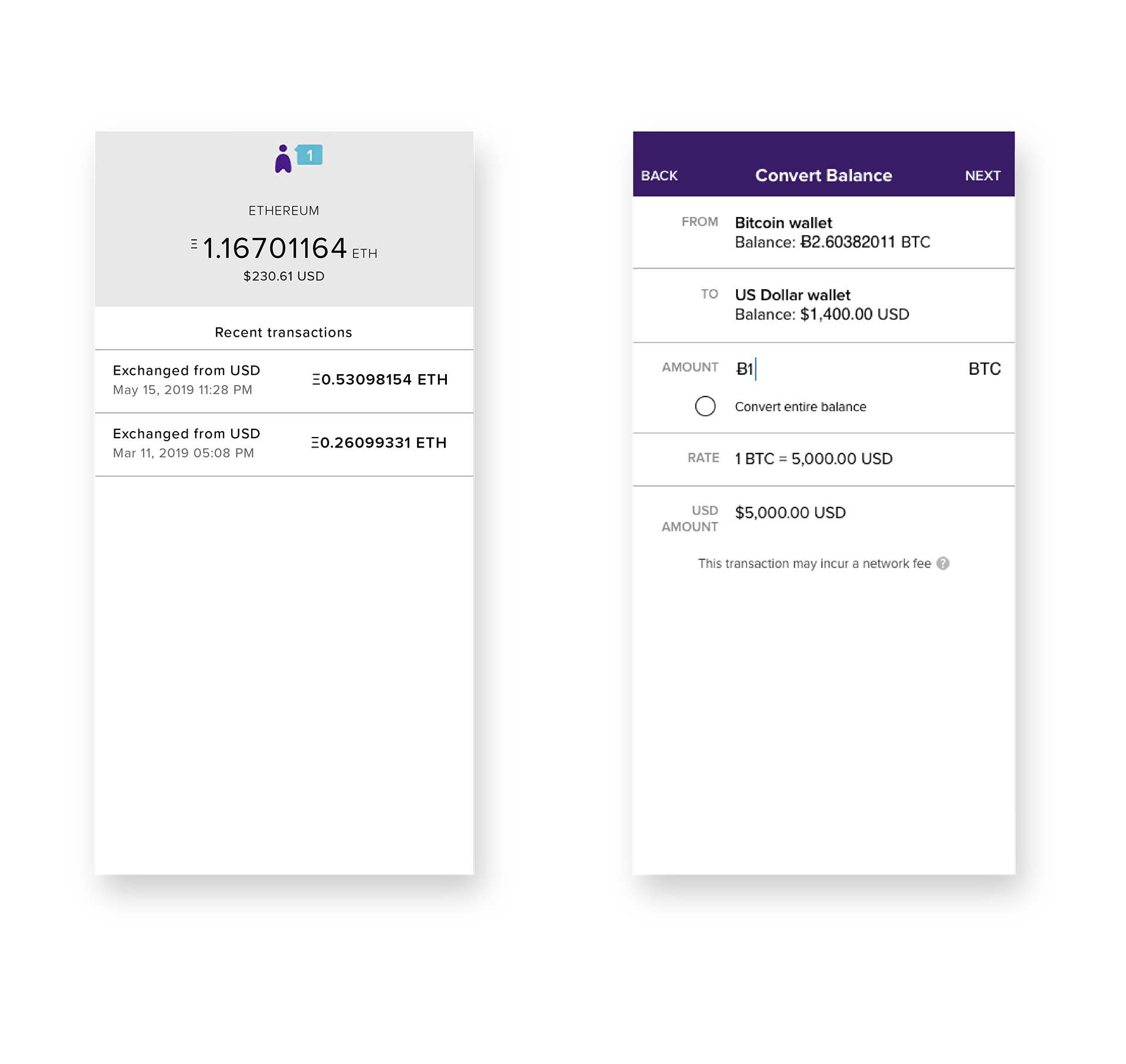
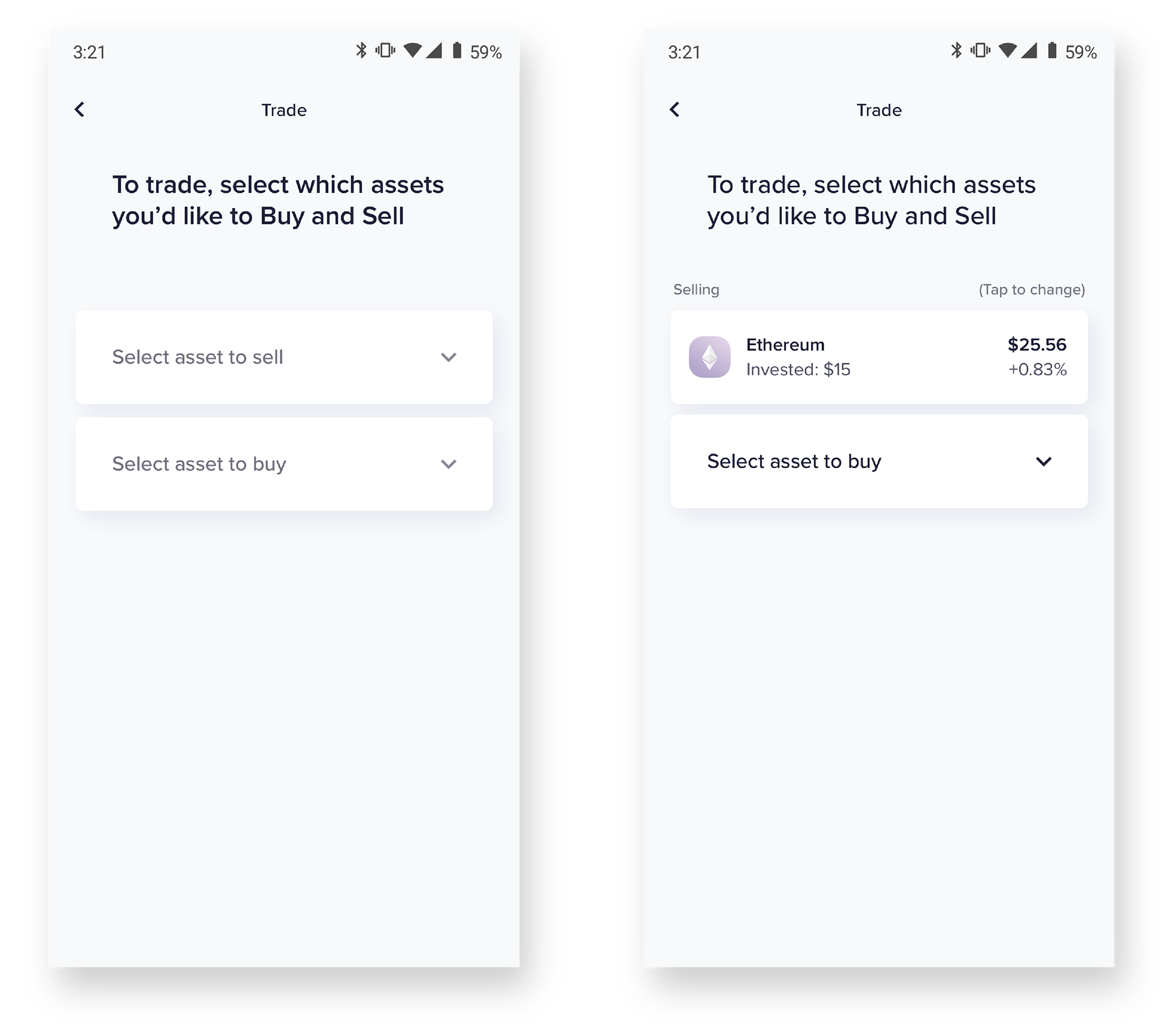
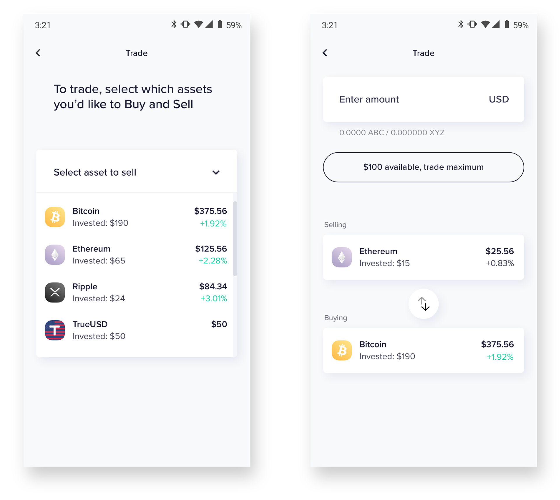
“Trading is very complicated, can’t tell what i’m buying, selling or what the fees may be”
- Streamline the trade process
- Present fees as clearly as price
- Prioritize amount input
- Present fees as clearly as price
- Prioritize amount input
KEY RESULTS & OBJECTIVES
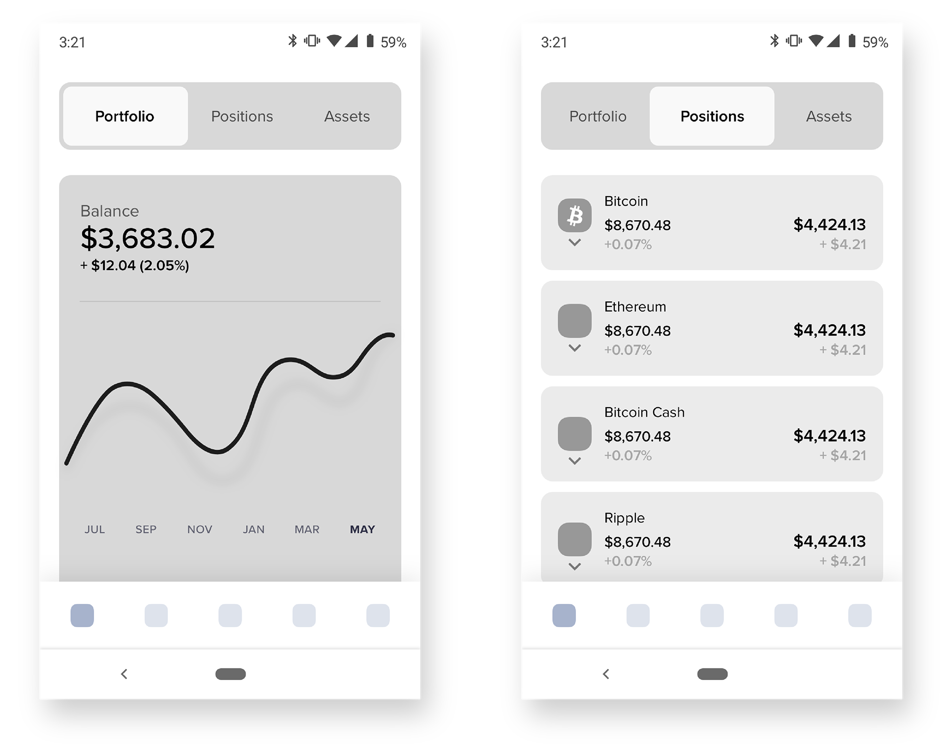
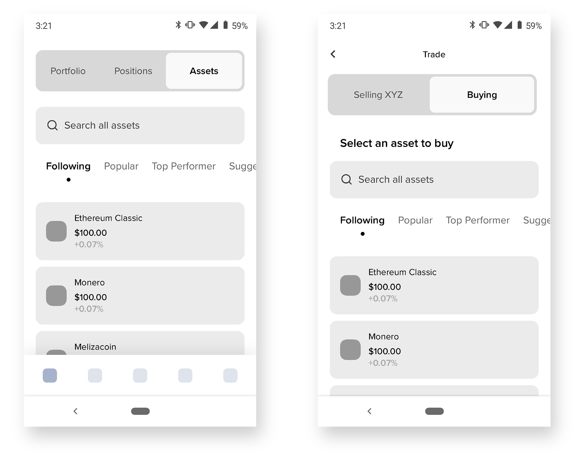
- Reevaluate Asset Card View
- Provide users with portfolio overview
- Simplify and update the design system
- Provide users with portfolio overview
- Simplify and update the design system
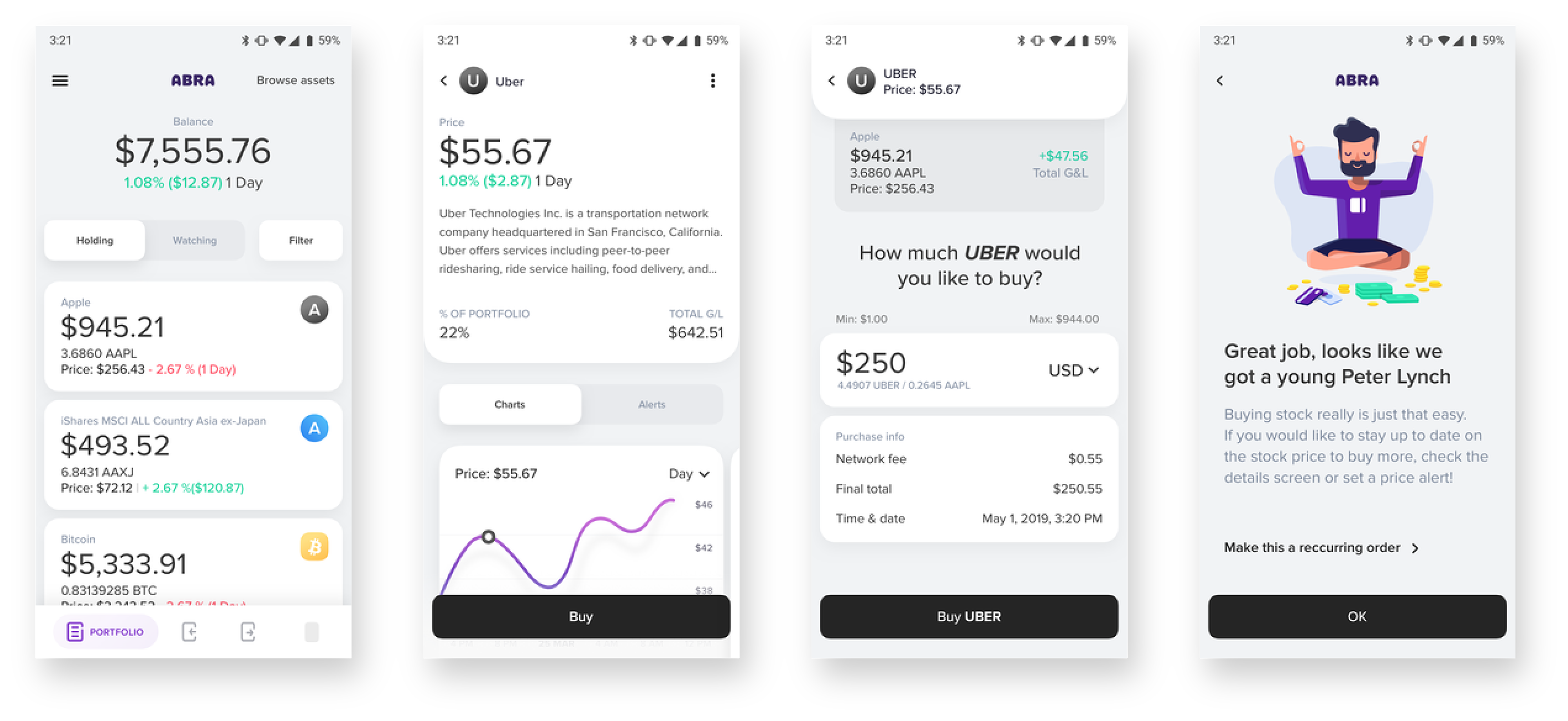
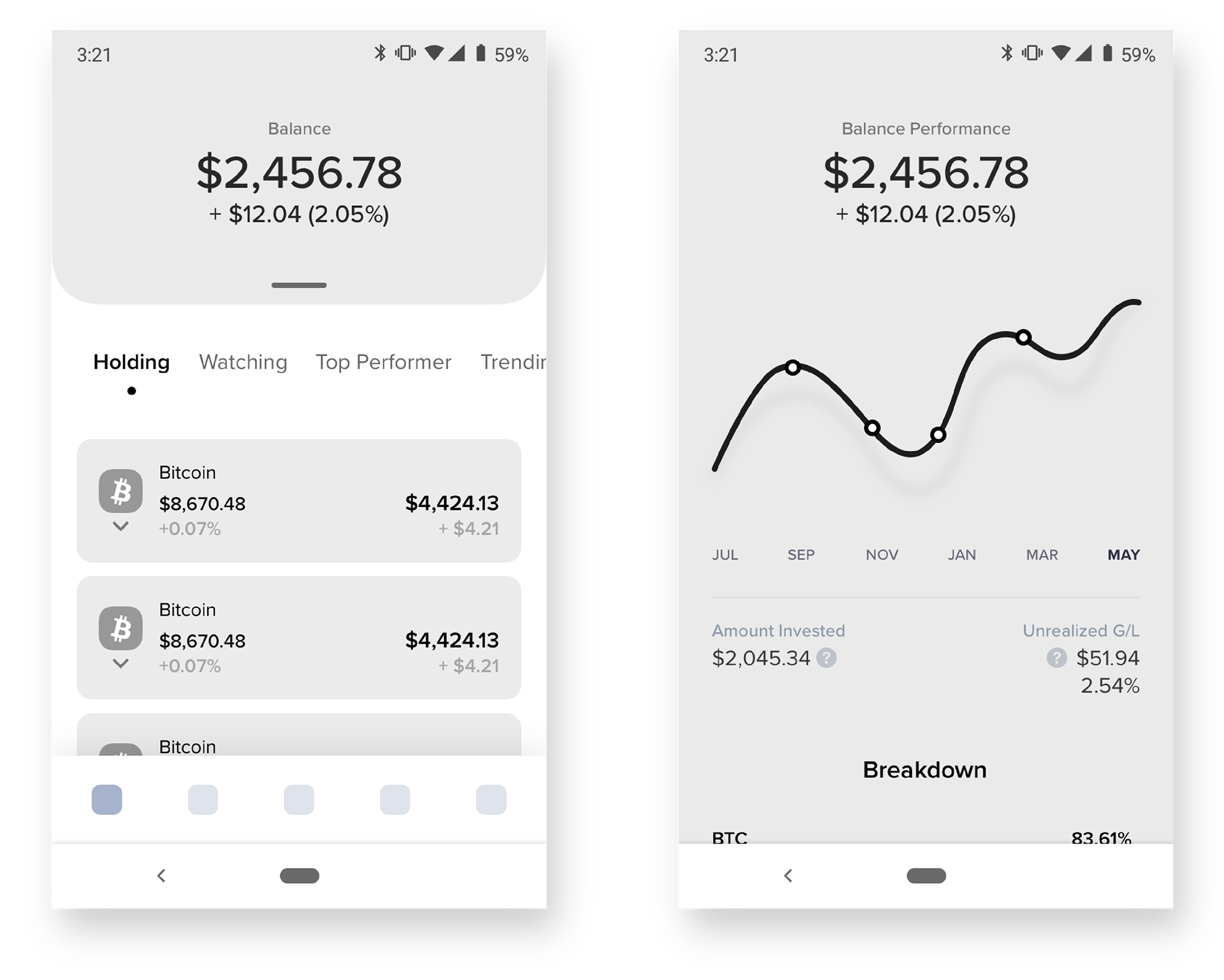
- Add more info to detail:
- Chart data, Price Alerts, Info regarding asset
- Chart data, Price Alerts, Info regarding asset
- Streamline the trade process:
- Present fees as clearly as price, Prioritize amount input
- Present fees as clearly as price, Prioritize amount input
WIREFRAMES
Throughout our research, we conducted multiple rounds of user interview using Lookback.io as a platform to test and using Invision for our prototyping. In each of these sessions we took away learnings we wouldn’t have been able to learn without testing versions prior. Each session was 30-45 minutes and included a free form exercise and a prototype walk-through. In the free exercise we positioned questions to best find what users were looking for in using Abra.
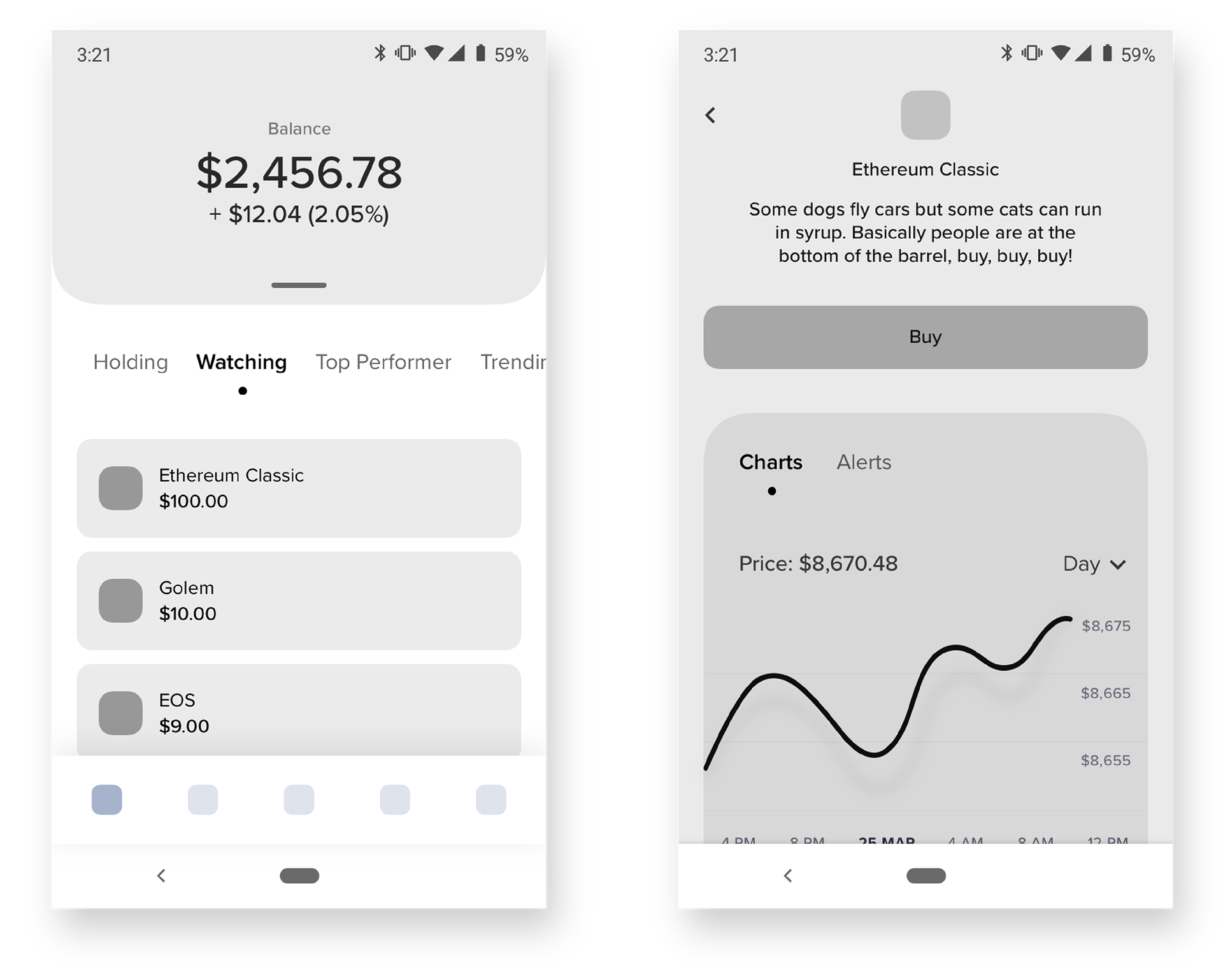
TEST 1
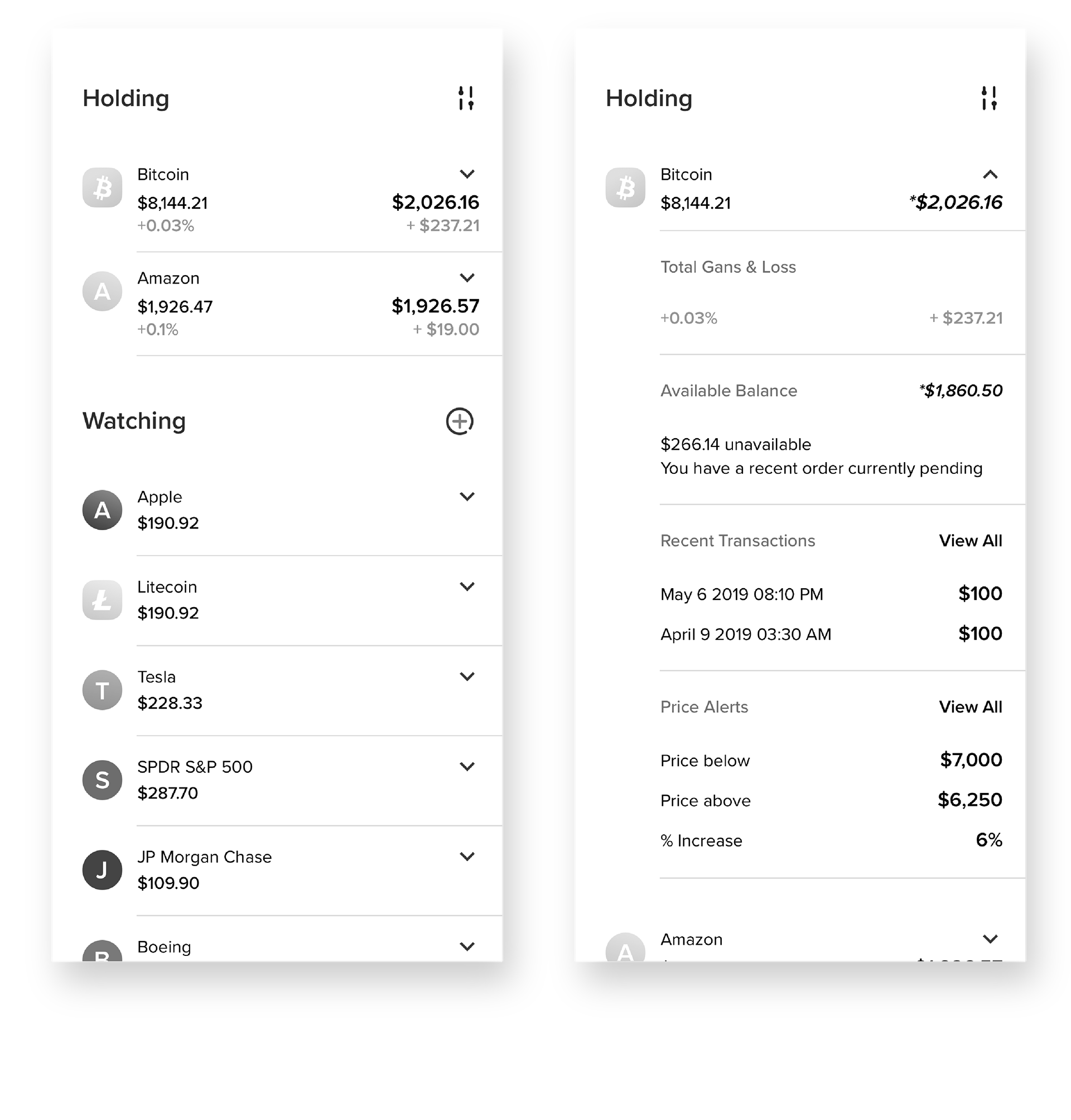
TEST 3
After around 4 different wireframe/prototype testing we had a much better understanding of what our users were looking for. By introducing a much more visual takeover of the users current investing status they felt more comfortable and knowledgeable upon first opening the app. Features and menus were quickly navigated through where they were once leaving users stuck or unsure of what to tap next.
A lot of effort went into understanding what information needs to be included in asset cards and within the asset detail. Within our research we learned that there isn’t one key target audience, but rather a large set of users needing both basic and advanced info ready in a moments notice.
We began thinking of ways that we can expose more data without complicating the app even further. During the UXR we tested having info that could collapse/expand when needed. Thus giving us the simplicity and complexity options at the same time. Users quickly gravitated to this as it solved a lot of their daily complaints.
VISUALS & NEXT STEPS
After creating and testing hundreds of wireframes the team felt it was time to start adding in visuals. At the time I was already starting on the company-wide branding I had been pushing for since I started at the company. In keeping with a lot of the original branding decisions I maintained a similar color palette to the previous but with a much needed upgrade. Next came button, input and navigation iconography as well as illustrations.
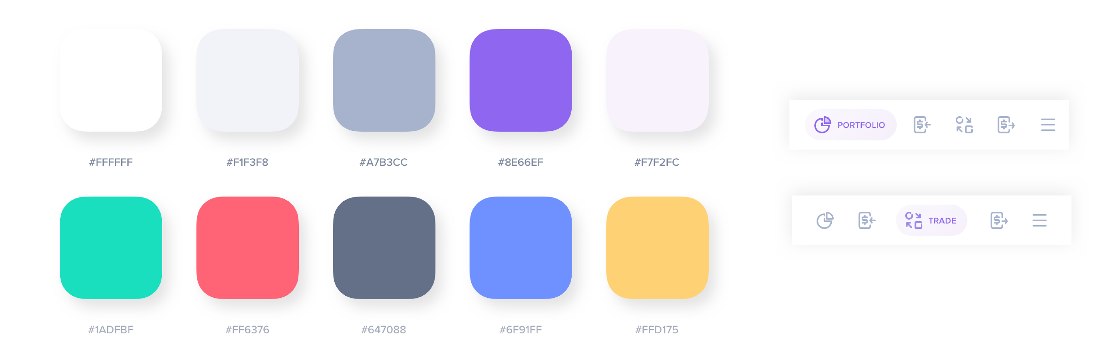
Working on this redesign from the ground up allowed me to pinpoint both users likes and dislikes in a way the company hadn’t researched before. By breaking each element of design down to its most basic level and testing its importance I was able to begin crafting a new design system app-wide. The previous app was a mashup of designs from 2014-2017, always adding more but never refining any of it. As my parting gift to the team I turned over a full design system proposal that would not only account for the features and examples shown above but also allow the team to grow and expand on features within the same library.
ADDITIONAL EXPLORATIONS